Capital One
2025
Supporting light and dark mode at scale

Project overview
Supporting Gravity across light and dark modes
Capital One’s Gravity Design System served as the global design system for product teams across the company’s digital financial experiences. As a design systems designer on the team, my work supported the addition of light and dark mode, helping Gravity become more flexible across themes, components, and product teams working at scale.
Problem
Gravity needed to support light and dark mode across a large set of components, but each component had its own construction, states, documentation, and implementation needs. This created a risk of inconsistency as updates moved from design into engineering and documentation.
Solution
The team used an established component update process to support Gravity’s transition to light and dark mode. Each component was reviewed, updated with the appropriate color options, checked for discrepancies, prepared for engineering implementation, validated through design QA, and documented with content partners before release.
Role
I contributed to the team by reviewing components, making design updates, identifying discrepancies, supporting engineering handoff, validating implementation, and updating documentation. Along the way, I also suggested improvements that helped clarify how work moved from design through release.

Process
Updating components systematically
1. Component Review
Each component began with a review of its existing construction, states, variants, and documentation. Requirements were established to identify the changes needed for light and dark mode support, while also surfacing inconsistencies that could affect the update.
2. Token and Mode updates
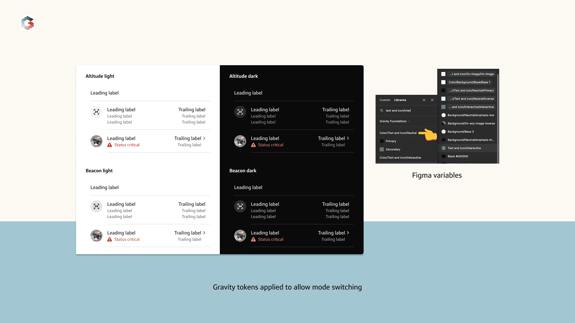
After the initial review, the appropriate light and dark mode color tokens were applied so the component could respond consistently across themes. The goal was to support mode switching within Figma rather than rely on one-off visual adjustments.
3. Discrepancy tracking
As components were updated, discrepancies sometimes surfaced in their construction, state behavior, functionality, or documentation. These issues were identified, discussed, and addressed based on their impact, creating opportunities to modernize components where appropriate.

Handoff
Engineering handoff and design QA
Once the design updates were approved, they were handed off to engineering for implementation. When the completed work returned for review, design QA helped confirm that the implementation reflected the intended behavior and remained consistent with the Figma component.

Documentation
Preparing guidance for release
Documentation was treated as a separate workstream because of the number of steps involved. The effort included revising the Figma documentation template, collaborating with a content lead, updating supporting images, and moving the guidance through review and sign-off before it was published to the live documentation site.

Decisions
Decisions that kept the system aligned
Treat light and dark mode as more than a color pass
Each component needed to be reviewed as a whole, with updates made to its construction, states, implementation requirements, and documentation where necessary.
Use the update to address discrepancies
When the work exposed inconsistencies, those issues were evaluated and addressed based on their impact and the needs of the component.
Keep the component process aligned
A component was not considered fully updated until the design assets, engineering implementation, and published documentation reflected the same intended behavior.


Outcome
A more flexible system across iOS and Android
The Gravity team successfully completed and implemented light and dark mode updates across iOS and Android design and engineering. The component update process helped the teams maintain quality and consistency as work moved through design, implementation, validation, documentation, and release.
During my final month, I took on Figma property preparation for a broader alignment initiative. With the help of AI, I organized component properties, reviewed comparisons, and consolidated proposed naming and classification changes into reference materials, checking in with the team throughout. This work prepared the Figma input for a subsequent workshop aimed at aligning component property naming conventions across other internal teams.
Explore more projects


